Door to Door service
Welcome to Holidaypac Packaging Solutions Factory!

tiger@holidaypac.com

+86 136 5233 6188
Welcome to Holidaypac Packaging Solutions Factory!
1-2 Days Free Customization
7-12 Days Production Time
12000m2+ Factory Since 2008
Door to Door service
Premium Chocolate Gift Packaging
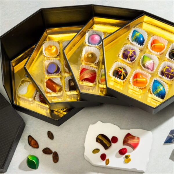
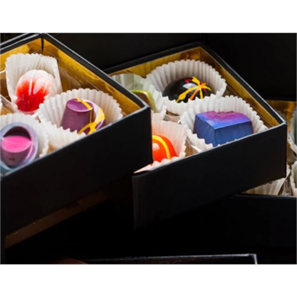
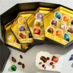
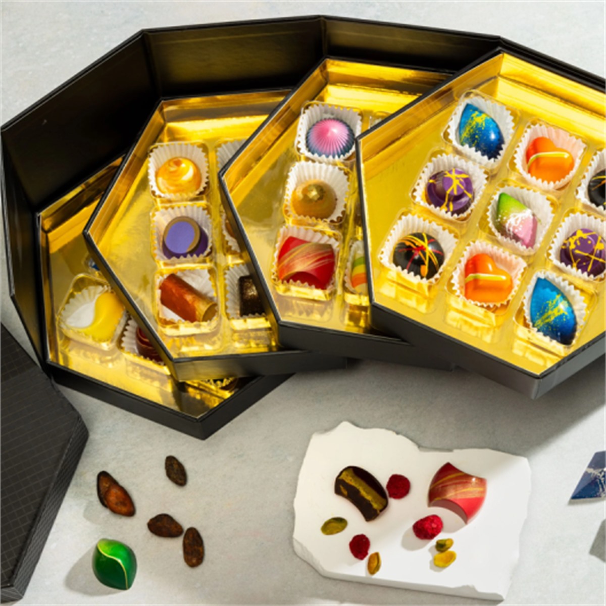
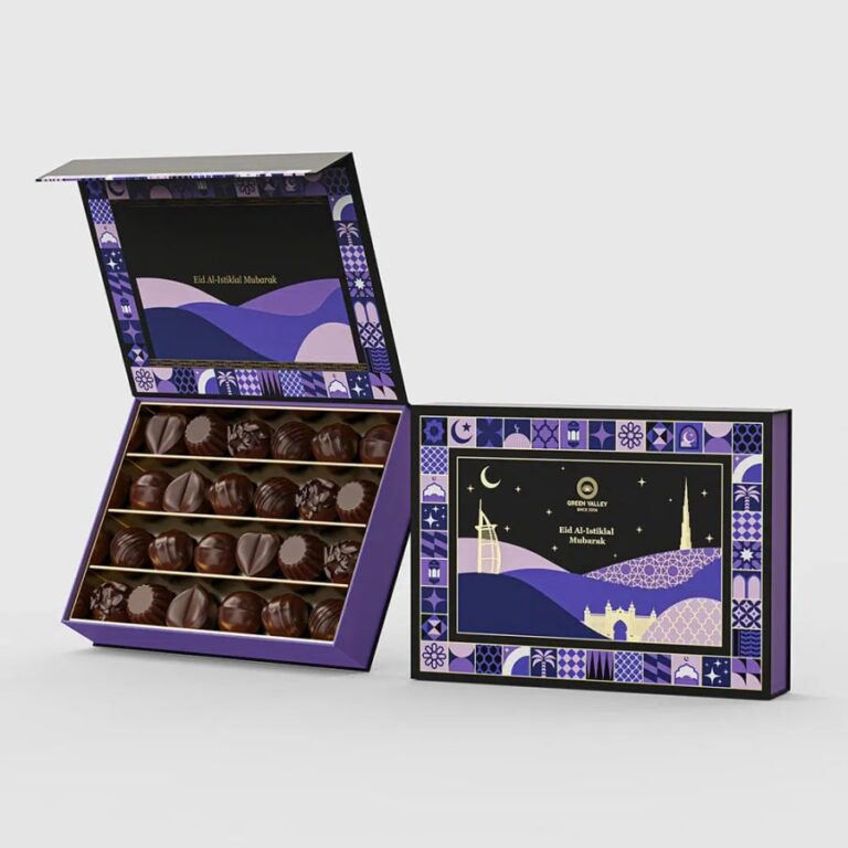
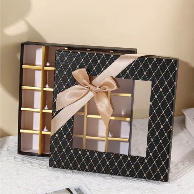
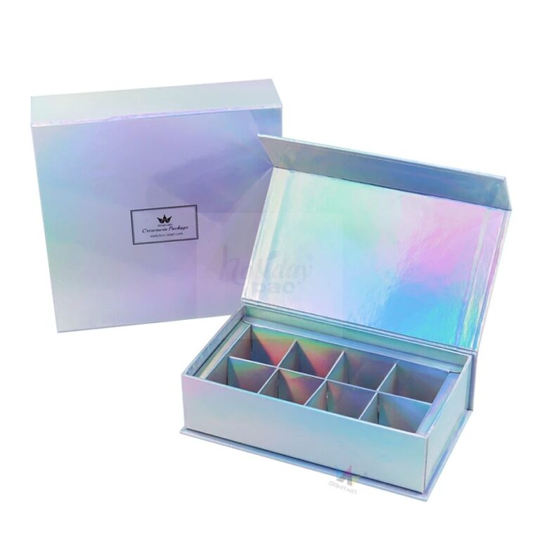
This custom multi-layer chocolate bonbon gift box is built for brands that want a more elegant presentation than a standard single tray. The layered structure gives each row of chocolates its own place, while the rigid shell, sliding trays and gold foil interior create a gift object that feels formal enough for boutique retail, corporate gifting and seasonal launches.
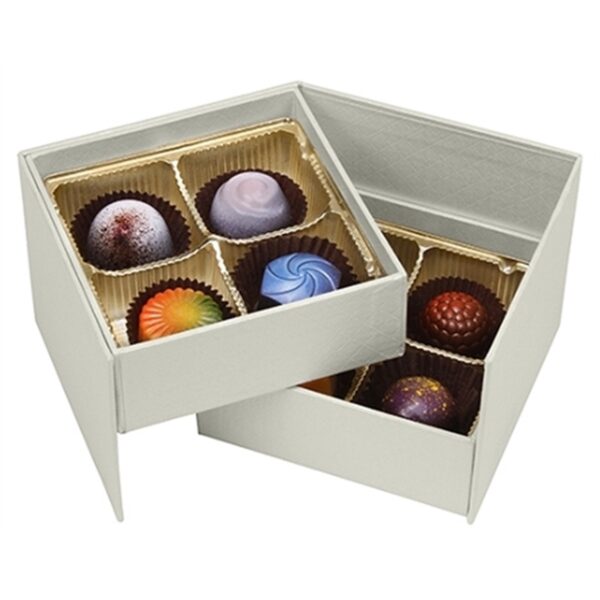
The same structural idea can be tuned for pralines, truffles, filled chocolates, mini bars and mixed confectionery assortments. If you want a simpler premium format, compare it with our custom two-layer chocolate gift box with sliding drawers and magnetic lid or our custom premium magnetic box packaging for luxury gift sets; if you need a drawer-based layout for a different treat, our custom printed macaron cookie drawer box with tray inserts shows how a tray system can be adapted to another product family.
Related Chocolate and Gift Packaging
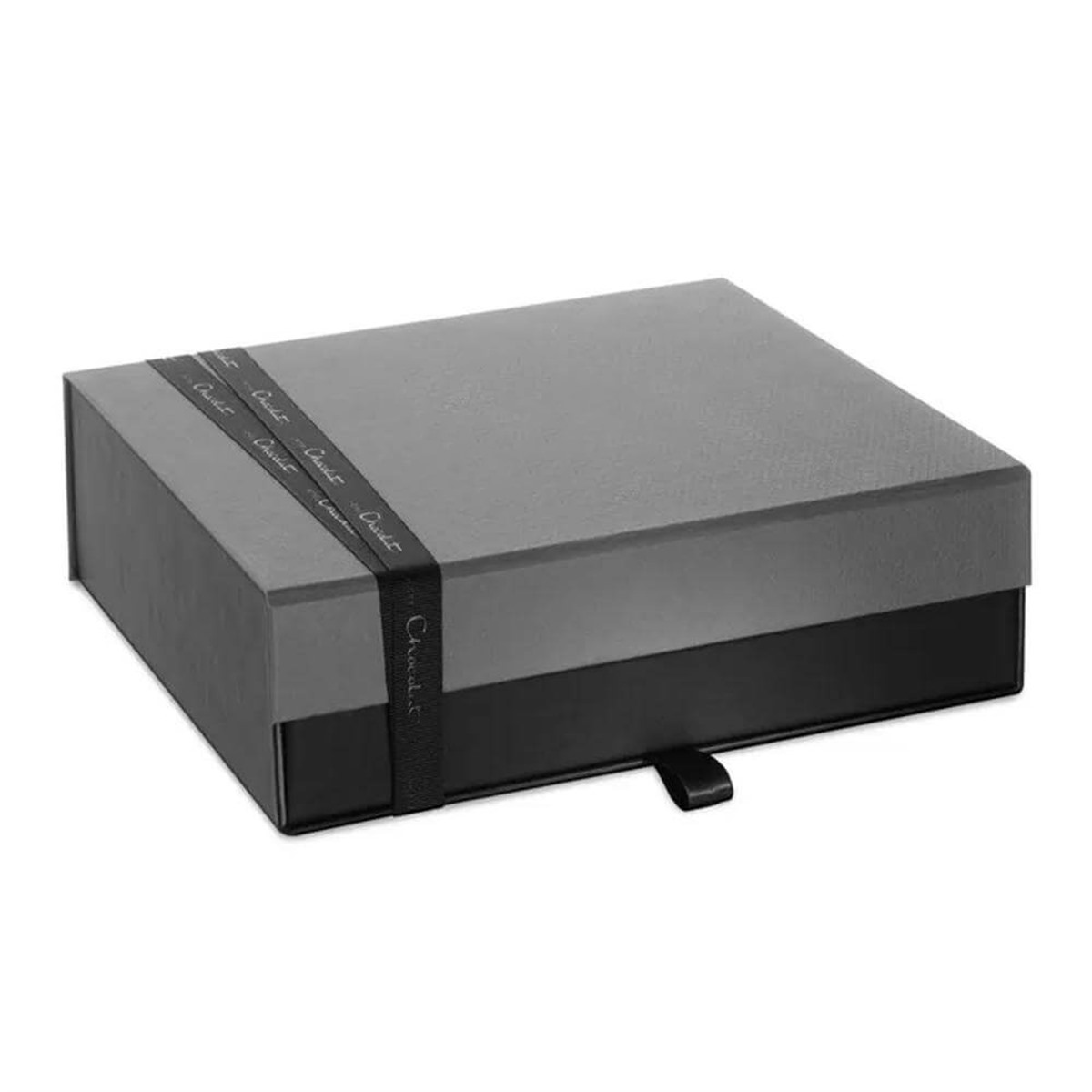 Custom Two-Layer Chocolate Gift Box with Sliding Drawers and Magnetic Lid
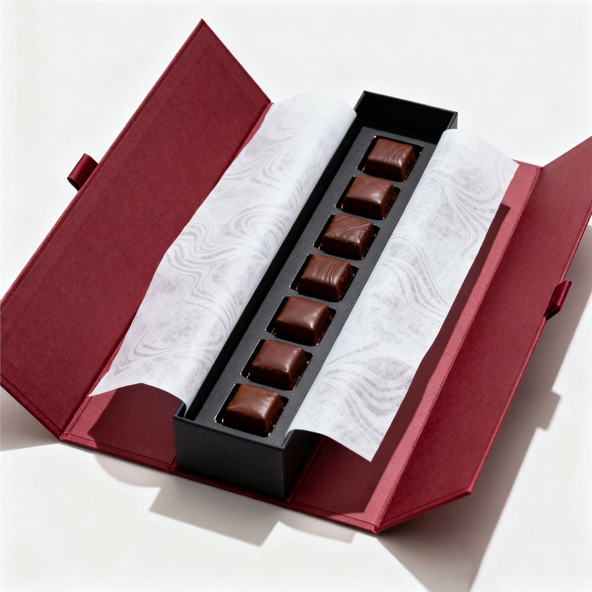 Custom Burgundy Magnetic Chocolate Gift Box with Tray Inserts
 Custom Candy Chocolate Gift Box with Ribbon and Tray Inserts
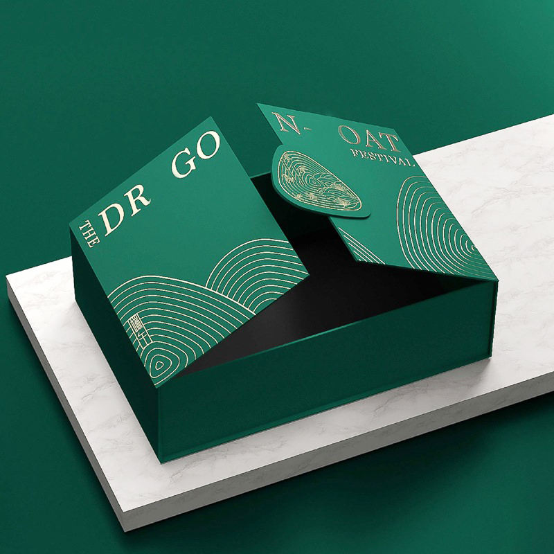 Custom Premium Magnetic Box Packaging for Luxury Gift Sets
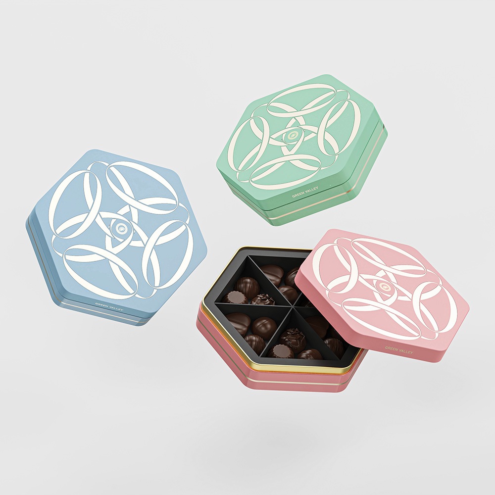 Custom Colorful Hexagon Chocolate Gift Box Packaging
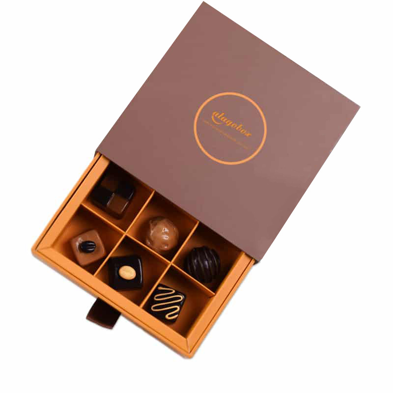 Custom Square 3×3 Paper Chocolate Packaging Box
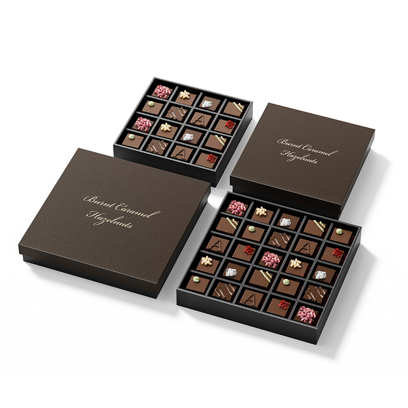 Custom Lid Bottom Chocolate Box Packaging with Inserts
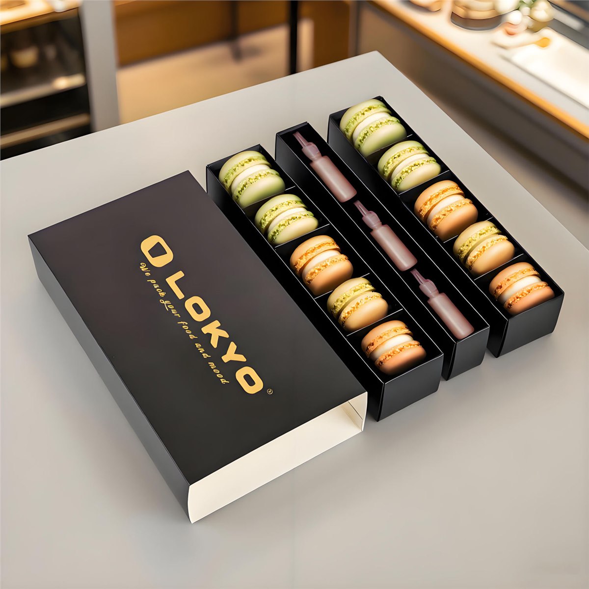 Custom Printed Macaron Cookie Drawer Box with Tray Inserts
Layered Gift Architecture
The main advantage of a multi-layer chocolate box is the feeling of discovery it creates. A single tray can be beautiful, but a stacked or sliding layout gives the recipient a sequence: open the lid, meet the first layer, pull out the second tray and uncover another group of chocolates. That rhythm makes the package feel more generous and more memorable, especially when the assortment is meant to be gifted rather than simply sold as a snack item.
This structure is also practical for assortments that contain different shapes or different value levels. A brand may place signature bonbons or premium pieces on the top level, then use the lower tray for wrapped chocolates, seasonal flavors or an inserted message card. Another brand may separate milk, dark and white selections so the customer can taste in a planned order. The box is therefore not only decorative; it becomes part of the product experience itself.
For the interior to feel composed, the tray depths, compartment widths and pull-tab positions should be planned around the actual finished product. A chocolate in a paper cup, foil cup or printed sleeve occupies more space than the bare piece, and that difference matters when the fit is tight. Holidaypacfactory can help size the drawers so the product sits neatly without shaking, pressing against the walls or appearing lost in the cavity.
A good layered box should also look steady when open. The upper level should not tip forward, the lower tray should glide without snagging, and the whole structure should remain balanced on the table. That is why the board thickness, side-wall height and internal guides matter as much as the artwork. When these elements are aligned, the box feels like a premium presentation piece rather than a simple container.
Gold Foil Interior
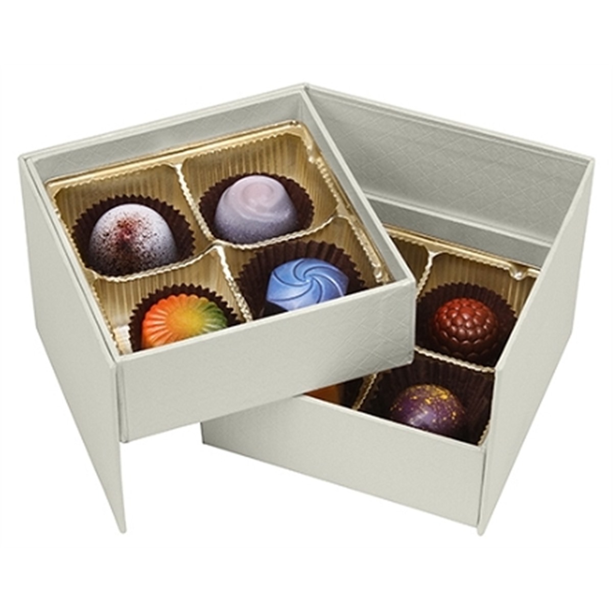
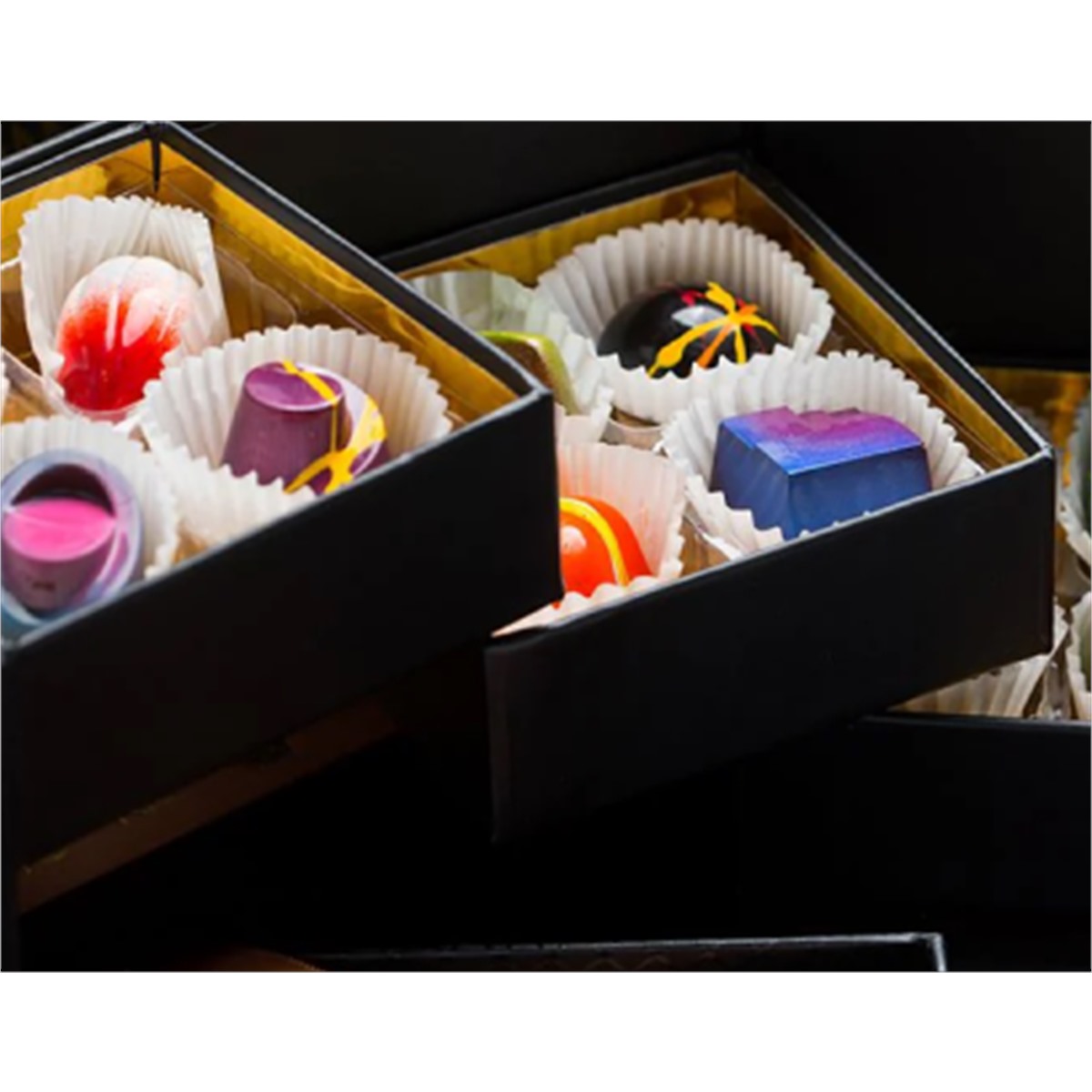
The gold foil interior is more than a decorative accent. It brightens the inside of the box, reflects light around the chocolates and adds a rich contrast against dark shells, white shells or deep brand colors. When the customer opens the package, the shiny interior creates a visual pause that separates the outside gift from the inside tasting moment. That separation is especially effective for bonbons and pralines, where color and texture are a major part of the appeal.
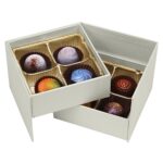
A black exterior with gold inside feels formal, crisp and dramatic. It suits premium retail launches, holiday sets and corporate gifting because the package reads as serious and polished. A white exterior with gold inside feels softer, lighter and more boutique-oriented. It can work well for weddings, hotel amenities, spring assortments and elegant everyday gifting. The same structure can therefore serve very different brands simply by changing the paper wrap, print treatment and surface finish.
The foil treatment can be extended beyond the interior if needed. Some projects use gold on the tray edge, the drawer pull, the inner lid border or a small logo panel. Others keep the outer shell quiet and let the gold remain hidden until the box opens. Both approaches can work. The right choice depends on whether the brand wants the product to feel understated from the shelf or more decorative from the first glance.
Luxury color planning is easiest when the box is treated as a complete visual system. The outer board, inner tray, cavity cups, pull tabs, logo placement and message card should all work together. If the chocolates are colorful, the interior should support that color rather than compete with it. The gold foil helps by acting as a warm neutral stage, especially when the assortment includes red fruit tones, purple shells, citrus accents or marbled finishes.
Insert And Food-Contact Planning
The insert system is the part of the project that determines whether the finished box feels professional. Bonbons and truffles are delicate. If they shift too much, the tops smear, the shapes lose their definition and the customer sees a messy interior instead of a premium assortment. That is why the tray cavities, paper cups, dividers and liner materials should be matched to the product weight and to the way the box will be handled in transit.
A good packing plan starts with the actual product dimensions, not only the artwork. Measure the finished chocolate with its cup, wrapper or label. Decide whether the cavity needs side clearance for gloved packing, whether the pieces should sit tightly for display, and whether the lower tray needs a deeper well for taller items. A layout that fits one flavor may not fit another, so the insert map should reflect the real assortment rather than an idealized drawing.
Food-contact planning is equally important. The outer rigid box may be printed paperboard, but the food path often depends on a liner, tray, paper cup or wrapped primary pack. If the chocolates are exposed in the display, the insert choice needs to respect the intended market and the way the product is stored. If the pieces are individually wrapped, the outer box can be more decorative, because the wrapper provides an extra layer between the product and the package.
This is also where the box family can branch into other formats. A brand that already uses our custom two-layer chocolate gift box with sliding drawers and magnetic lid may want to adapt the same internal logic to a macaron set, a cookie assortment or a gift sampler. The tray system can be reused, adjusted or simplified depending on the product weight. That flexibility is what makes a rigid package useful for more than one campaign.
Applications
For confectionery brands, the obvious use is bonbons, pralines and truffles. The layered format gives the assortment a curated feel, especially when the top level introduces the hero flavors and the lower level carries limited-edition pieces. It is equally strong for wedding favors, because the box already feels like a keepsake. A bride and groom can use the outer artwork for names, dates or a small message, while the interior carries sweets that feel precious rather than casual.
Corporate gifting benefits from the same structure. A company can place its logo on the outside and use the interior for a thank-you message, seasonal greeting or client note. Because the box feels refined when closed and generous when open, it works for investor gifts, staff appreciation, holiday client kits and premium event giveaways. The presentation says the contents were selected deliberately, which is exactly the effect most corporate buyers want.
Hotels and hospitality brands can use the design for welcome amenities, suite gifts, spa treats or anniversary packages. A white colorway can feel calm and fresh, while a black colorway feels formal and upscale. Seasonal campaigns can lean warmer, darker or more festive without changing the basic structure. That gives the brand a reusable platform that can return in different art directions each year.
The box also works well as a bridge between retail shelf appeal and social media presentation. The outside can stay elegant and restrained, while the open drawers, gold interior and color-sorted chocolates create a more photogenic interior. That balance helps brands that want the package to sell in person, online and at events without redesigning the structure for each channel.
Materials And Finishes
A layered chocolate gift box depends on structure before decoration. The outer shell usually needs a rigid board grade that can support the weight of several trays while keeping the corners straight and the lid aligned. If the board is too light, the front edges may bow after filling. If it is much heavier than necessary, the package may become expensive and less efficient to ship. The right board choice balances strength, touch, appearance and packing requirements.
The paper wrap defines the first impression. A matte black paper gives the box a calm formal look, while a white textured paper makes the same shape feel cleaner and more delicate. Soft-touch finishes can add a refined hand feel, gloss can sharpen printed colors, and specialty papers can create a more boutique character without using too much decoration. For many chocolate brands, a quiet outside and a gold interior create the strongest contrast.
Logo finishing should be planned around the way the box will be held and photographed. Foil stamping works well for a small front mark, an inner lid message or a narrow line around the tray. Embossing and debossing can add depth to plain paper, especially when the brand wants a tactile detail rather than a colorful print. Spot coating can highlight a pattern, but it should not make the surface feel busy when the chocolates are already colorful.
The finish list should also consider production consistency. A luxury box often uses several materials in a small area, and each material responds differently to folding, wrapping and adhesive. Sampling helps confirm that the gold interior stays smooth, the outer paper does not crack at the edges, the logo is centered, and the drawers still move after all finishes are applied. That practical check protects the premium look buyers expect.
Order Planning Guide
Start with the product itself. Count every piece that will go into the box and measure it in the final packed condition. A bonbon inside a cup, a truffle with a dusting, or a chocolate with a sleeve all occupy different space. If the box is planned from the bare chocolate only, the final cavity may be too tight. If it is planned too loosely, the assortment may move and lose its neat appearance.
Decide which tray should carry the visual hero. Many brands place the most colorful or highest-value items on the top layer because that is the first thing the customer sees. The lower tray can then hold complementary pieces, a seasonal surprise or a message card. A two-stage reveal is only effective if the sequence has a clear purpose, so define the order before drawing the final layout.
Choose the exterior color with the interior experience in mind. Black gives the box formality and contrast. White gives it freshness and a softer luxury feel. Deep burgundy or dark green can work if the brand wants a richer seasonal mood. The gold interior can remain constant across all of these versions, which makes the system flexible while keeping the opening moment recognizable.
Review the pull mechanism during sampling. The drawer should open smoothly enough for a gift moment, but not so loosely that it feels flimsy. The pull tab should be easy to find without interrupting the clean front panel. If the box will be packed repeatedly by hand, the tab shape and tray tolerance should also support speed on the filling table.
Think about the internal message. A premium chocolate box is not only holding product; it is carrying a mood. A tasting note, flavor map, ingredient panel or thank-you card can turn the package into a more informative and more memorable experience. The placement of that card matters. It can sit under the lid, inside the top tray or in the lower drawer depending on the storytelling goal.
Check the structure against shipping conditions. The same box that feels elegant in a studio may need extra protection in transit. Corner reinforcement, tissue, outer cartons or fitted shippers can all help. If the box is used for ecommerce, it should be tested in the condition in which the customer actually receives it, not only in the condition in which it is photographed.
Plan the artwork around the viewing sequence. The customer may first see the closed exterior, then the open lid, then one tray, then the next. That means the logo, flavor names and artwork hierarchy should make sense at each step. A beautiful box can still be confusing if every surface competes for attention. Keep the primary message clear and let the interior reward the opening.
If the program has several sizes, build a family rather than a single isolated item. One structure can be used for small retail assortments, medium gift sets and larger presentation boxes by adjusting the outer footprint and drawer depth. That makes future launches easier because the brand keeps a consistent visual identity while the capacity changes.
Use the sample to check real handling. Open the box, close it, pick it up, set it down, and slide each drawer several times. Look for rubbing on the corners, pressure on the lid and movement in the inserts. Small technical issues are easiest to solve at the sample stage. Once the structure is approved, it becomes much easier to reproduce the same feel in production.
For recurring seasonal programs, save the approved size, paper specification, finish combination and insert map. That allows the box to return with a new message, color palette or flavor mix without redoing the entire structural project. Consistency saves time, and it also helps customers recognize the brand from year to year.
When you request pricing, send the artwork files, the product count per layer, the packed dimensions, the target quantity and the destination market. Include any special note about food-contact handling, custom sleeves or secondary packing. A precise brief lets the factory answer faster and gives you a sample that is closer to the final result.
If you need a broader packaging family for future assortments, keep the related structures in mind. A layered bonbon box, a magnetic gift set and a drawer-style cookie box can all share the same premium logic, which makes the brand easier to recognize across categories and campaigns.
The final review should include the customer journey, the packing workflow and the warehouse journey. Confirm that the closed box looks polished on a shelf, that the open box presents the chocolates clearly, that the trays can be filled without awkward handling, and that finished units can be packed into a shipping carton without excess movement. Looking at all three moments together helps the packaging remain beautiful, practical and repeatable.
A strong presentation also leaves room for future communication. The inside lid can carry a short brand story, flavor sequence or care message, while a removable card can be updated for a new collection. This lets the structure remain stable while the campaign changes. For brands building a premium confectionery line, that flexibility can reduce redesign work and make each new assortment feel connected to the last one.
Product Specifications
| Product type | Custom multi-layer chocolate bonbon gift box with sliding trays and gold foil interior |
|---|---|
| Structure | Rigid paperboard outer shell with stacked tray or drawer sections |
| Closure | Custom lid, magnetic closure or folding cover by project |
| Interior finish | Gold foil effect, coated board, printed liner or custom wrap finish |
| Colorways | Black edition, white edition and custom brand color versions |
| Inner support | Tray cavities, dividers, paper cups, liners and project-specific food-contact planning |
| Suitable contents | Bonbons, pralines, truffles, mini bars, wedding sweets, hotel gifts and corporate assortments |
| Order support | Sampling, artwork adjustment, structure review, production planning and export packing guidance |
Frequently Asked Questions
Yes. The structure can be planned as two layers, three layers or a different drawer sequence depending on the assortment and the presentation goal.
Yes. The outer shell can be finished in black, white or a custom brand color while keeping the gold interior effect and the same general tray logic.
Yes. The cavities, dividers, cups and liners can be matched to bonbons, pralines, truffles, wrapped chocolates or mixed gift assortments.
The outer box can be paired with a suitable inner packing plan based on your product, storage conditions and handling requirements.
Yes. The layered opening, premium finish and organized tray layout are ideal for corporate gifts, weddings, hotels and seasonal gifting.
Send the product dimensions, piece count per layer, artwork files, color direction, finish preference, order quantity and destination market so the quotation can be accurate.
Start Your Custom Project
Send Holidaypacfactory your pack count, product dimensions, preferred colorway, finish direction and expected quantity. We will help you plan the rigid shell, layered trays, gold foil interior, insert map, printing and export packing so the finished box is ready for premium retail and gifting.
 Cassie LanFounder, HolidayPac · Leave a message
Food packaging, paper bags and food service paper for your next project.
Leave your request anytime. Our sales team will reply with pricing, samples and production details.
Leave your request anytime. Our sales team will reply with pricing, samples and production details.
Tell us what you're packaging and we'll ship a physical sample plus a free 3D mockup within 24 hours — no cost, no obligation.
We've received your inquiry and our team will get back to you within 24 hours.