


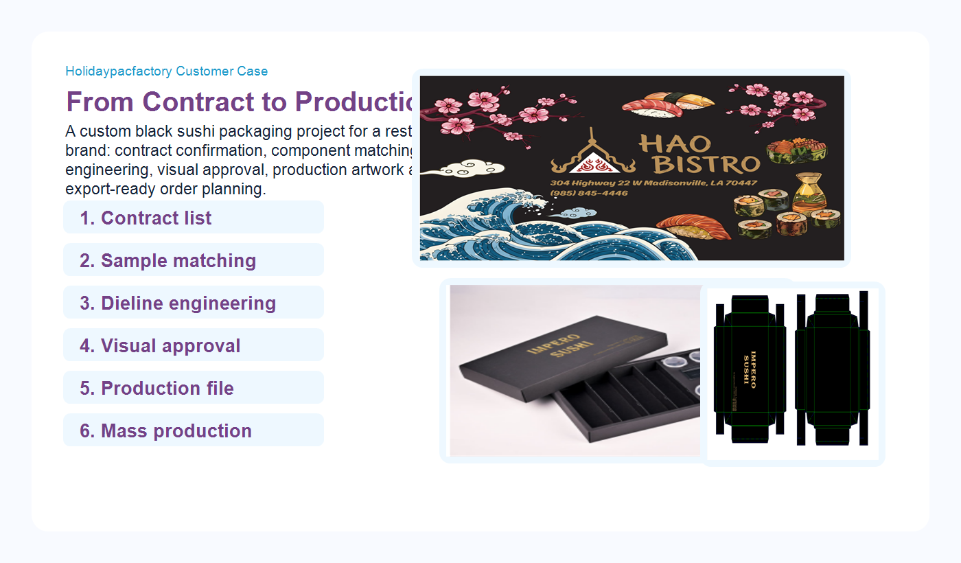
Holidaypacfactory customer case Custom Sushi Packaging From Contract to ProductionThis customer case follows a real sushi restaurant packaging project from contract confirmation to production preparation. The buyer needed two black foil-stamped sushi box formats, a matching black kraft paper bag, and a coordinated brand presentation that could carry a premium Japanese-inspired dining feeling while staying practical for mass production. For Holidaypacfactory, a custom sushi packaging project is not only a beautiful mockup. It is a controlled process: confirm the contract list, translate the buyer’s visual language, match physical components, test insert positions, prepare dielines, review print placement, and make the final production file clear enough for factory execution. contract reviewsample matchingdieline engineeringmass production |
The Customer Needed Premium Sushi Packaging That Could Still Be Manufactured Reliably
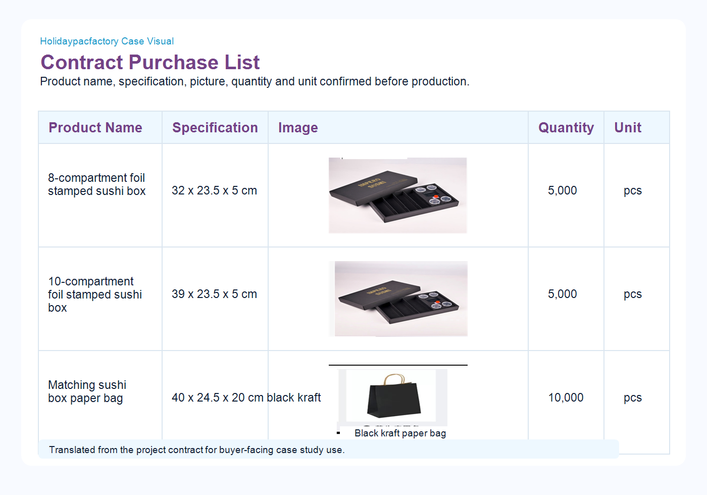
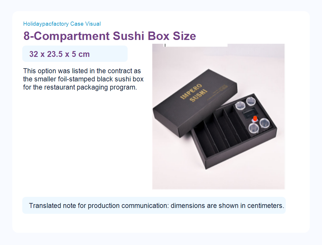
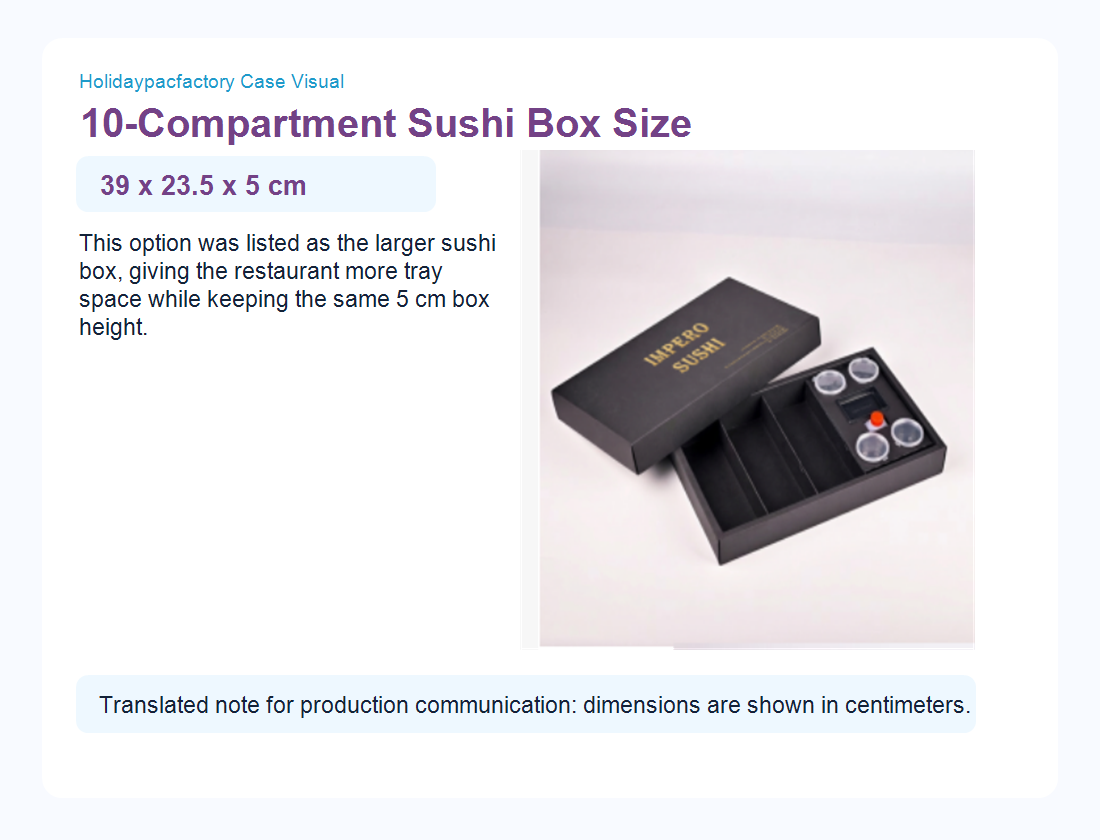
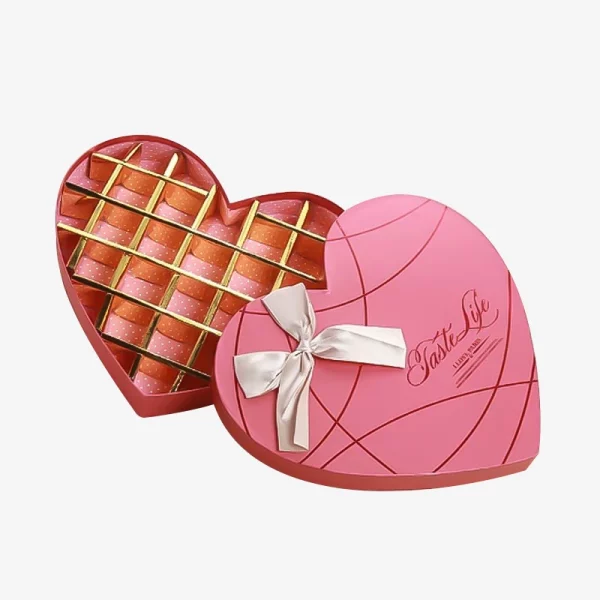
The project began with a restaurant brand visual reference and a contract list. The visual reference showed a dark background, warm gold typography, Japanese-inspired food illustration, waves, blossoms and sushi imagery. The contract list confirmed the commercial scope: one 8-compartment foil-stamped sushi box at 32 x 23.5 x 5 cm, one 10-compartment foil-stamped sushi box at 39 x 23.5 x 5 cm, and one matching black kraft paper bag at 40 x 24.5 x 20 cm. The two sushi box SKUs were each planned at 5,000 pieces, while the paper bag quantity was 10,000 pieces.
This combination tells a common story in restaurant packaging. A buyer wants the packaging to feel premium, but the factory still has to solve practical questions: how the tray fits, how the lid opens, how the insert holds small round cups, whether the sauce bottle has enough clearance, how the paperboard structure folds, where the gold logo lands, and how the two sizes can share a consistent brand system without forcing the same internal layout.
Holidaypacfactory handled the project as a controlled development sequence rather than a single print order. The contract became the baseline. The brand reference became the mood and color direction. The physical sample became the proof of fit. The dieline became the production language. This is the difference between selling a box and managing a packaging project.
Step 1 Contract Confirmation Turned the Idea Into a Manageable Production FileA contract list is not only a purchasing document. For custom food packaging, it is the first production control sheet. It fixes product name, specification, picture reference, quantity and unit. In this case, the list separated the two sushi box formats and the matching bag, which allowed the Holidaypac team to review each item with the correct structural expectation. The smaller 8-compartment sushi box needed enough space for a compact sushi set while keeping the outside dimension manageable for takeaway, catering and restaurant pickup. The larger 10-compartment sushi box needed more tray space while keeping the same 5 cm height. That shared height helped the visual family feel consistent, but the inner insert still required separate checking. By confirming these details early, Holidaypacfactory avoided a common packaging problem: beautiful visuals that do not match the ordered specification. The contract gave the factory a stable starting point for sample matching, artwork review, costing, material planning and production scheduling. |
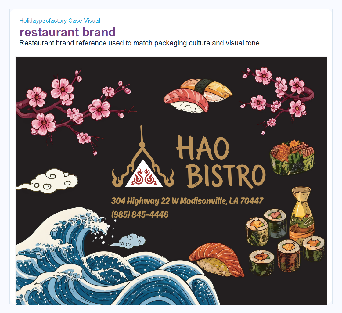
Step 2 The Restaurant Brand Reference Guided the Color, Mood and Premium FeelingThe restaurant brand reference used a black background, gold lettering, sushi illustrations, waves and blossom elements. Holidaypacfactory did not copy every decorative element into the box. Instead, the team translated the reference into a packaging direction: black paper surface, restrained gold foil, clean lid placement, and an inner structure that felt organized rather than crowded. This is important because restaurant packaging has to carry a brand feeling in a few seconds. The box may be seen on a counter, delivered to a table, photographed by a customer, or opened during a catering event. A black and gold system can feel premium, but only when the print position, paper surface and box structure are controlled. Too much decoration can make the package expensive and visually noisy. Too little connection to the brand can make the package feel generic. The Holidaypac approach was to keep the brand signal strong but production-friendly: logo and contact details on the lid, clean black panels, clear fold lines, practical insert space, and enough contrast for the gold brand mark to remain visible after printing and finishing. |
Component Matching Checked the Real Objects Before the Structure Was Finalized
The sample matching image shows three important components: a sauce bottle, a clear cup lid and a black sushi tray. The numbers are simple, but they represent a very practical factory conversation. A sushi packaging set is not an empty rigid box. It has to hold food trays, small sauce containers, inserts and sometimes bottle-shaped accessories. If those objects are not checked early, the final package may look good in a rendering but fail during real use.
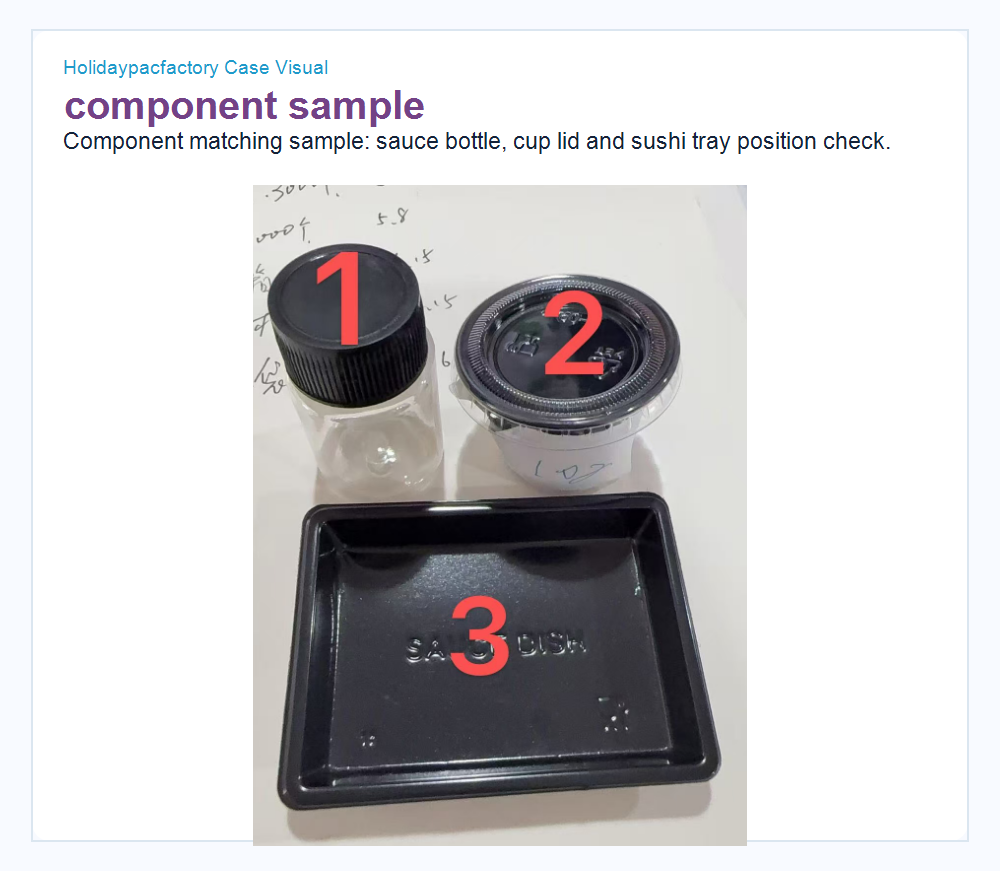
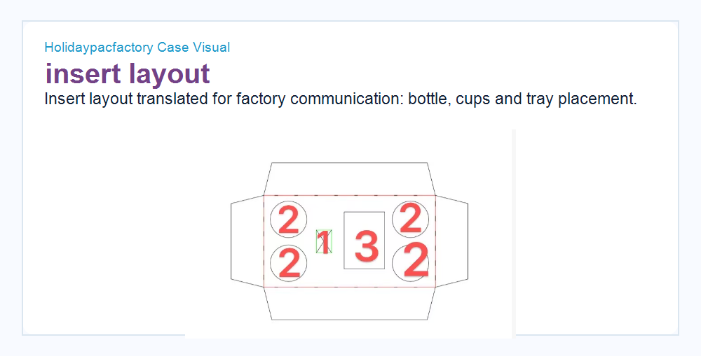
For buyers, this step may look small, but it often decides whether the project becomes smooth. The factory needs to know whether the round cups are decorative reference parts or actual parts that must fit inside the box. The tray edge, lid diameter and bottle height all influence the insert. A few millimeters can decide whether the package closes cleanly, whether the contents shake during transport, and whether the customer sees a tidy opening experience.
Holidaypacfactory uses this type of visual matching to make communication easier between sales, engineering, sampling and the buyer. Instead of relying only on written descriptions, the team marks the parts, confirms the layout and then turns the decision into a production-ready dieline.
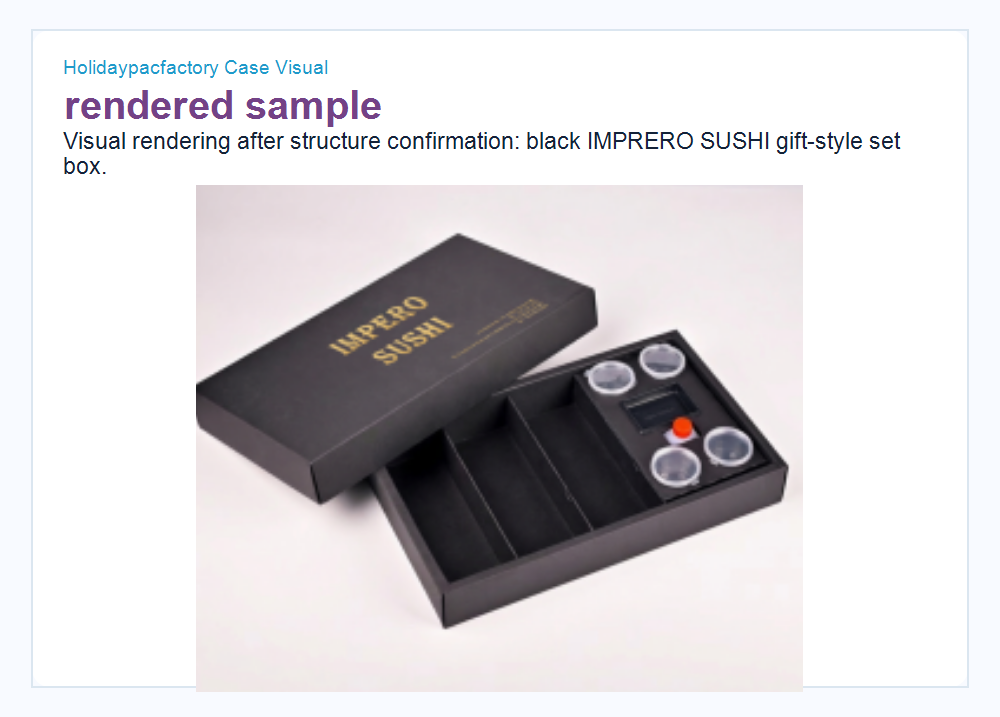
Step 4 The Rendering Helped the Buyer Approve the Experience, Not Only the ShapeA rendering is useful only when it answers real buyer questions. In this project, the rendering showed how the lid, base, compartments and sauce cup area would work together. It also helped the buyer judge whether the IMPRERO SUSHI brand mark looked strong enough on a dark surface and whether the open-box view matched the restaurant’s premium positioning. The rendering also showed the value of structural restraint. Instead of trying to fill every panel with graphics, the package used black as the main surface and gold as the signal. The internal dividers kept the food presentation organized. The sauce cup area was visible without dominating the package. This gave the buyer a clear direction before spending money on mass production. For Holidaypacfactory, this approval stage helps connect design emotion with production discipline. A buyer may approve a mood, but the factory has to translate that mood into board, ink, foil, fold, glue and packing. |
Two Box Sizes Were Kept in One Visual Family
The customer ordered two sushi box formats: 32 x 23.5 x 5 cm and 39 x 23.5 x 5 cm. The shared 23.5 cm width and 5 cm height allowed Holidaypacfactory to keep the packaging family consistent. The length difference gave the restaurant two serving formats while preserving a similar hand feel and stacking logic.
This kind of family planning matters for restaurant buyers. If every SKU has a different visual rhythm, the packaging program becomes harder to manage and weaker in brand recognition. If every SKU is forced into the same internal structure, the food presentation may suffer. Holidaypacfactory balanced both sides: consistent outside brand language, specific internal structure for each size.
The paper bag also mattered. A matching black kraft bag creates a complete takeout or gifting moment. It supports the premium box without forcing every brand element onto the bag. For many restaurant brands, this is where packaging starts to feel like a full customer experience rather than a single container.
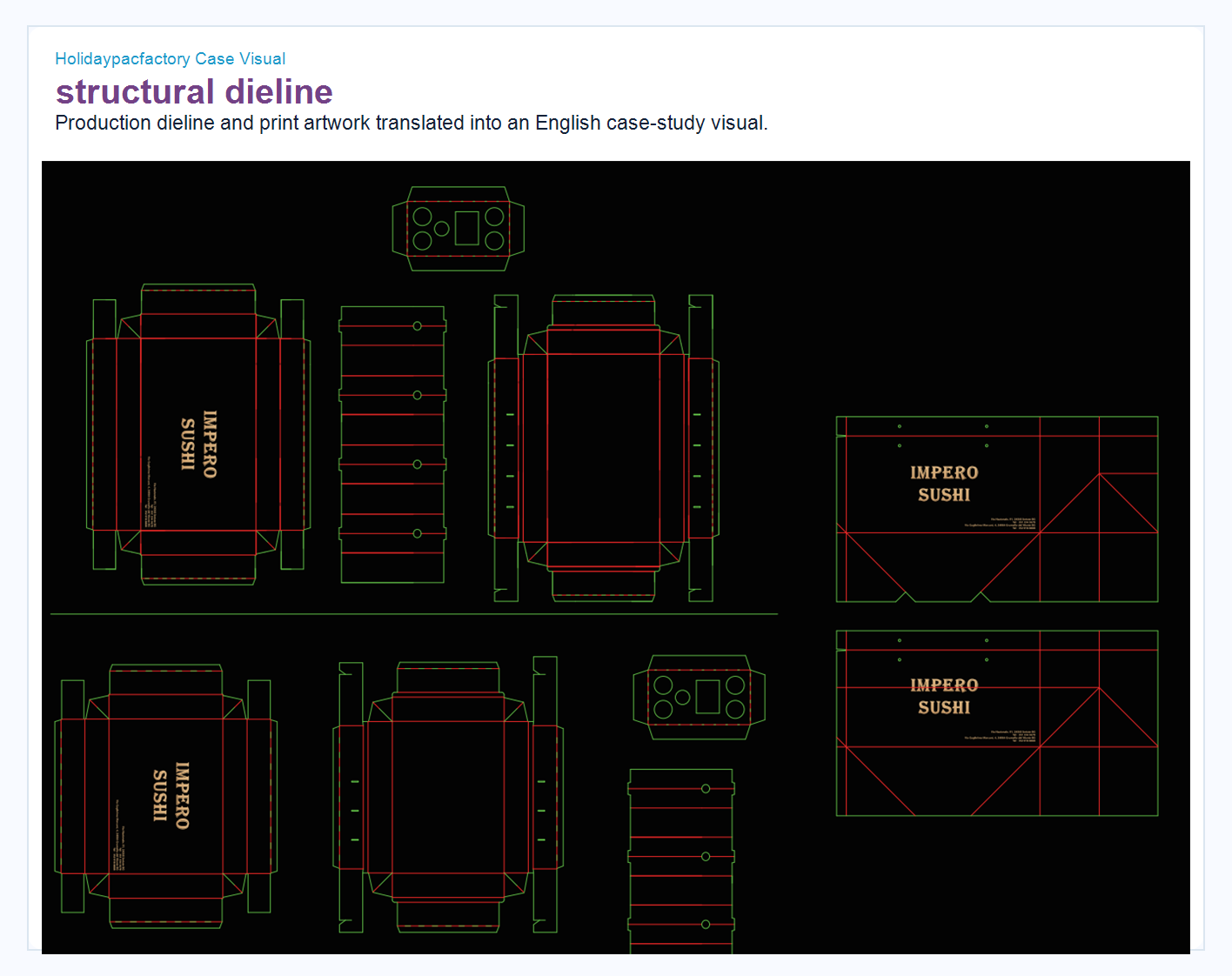
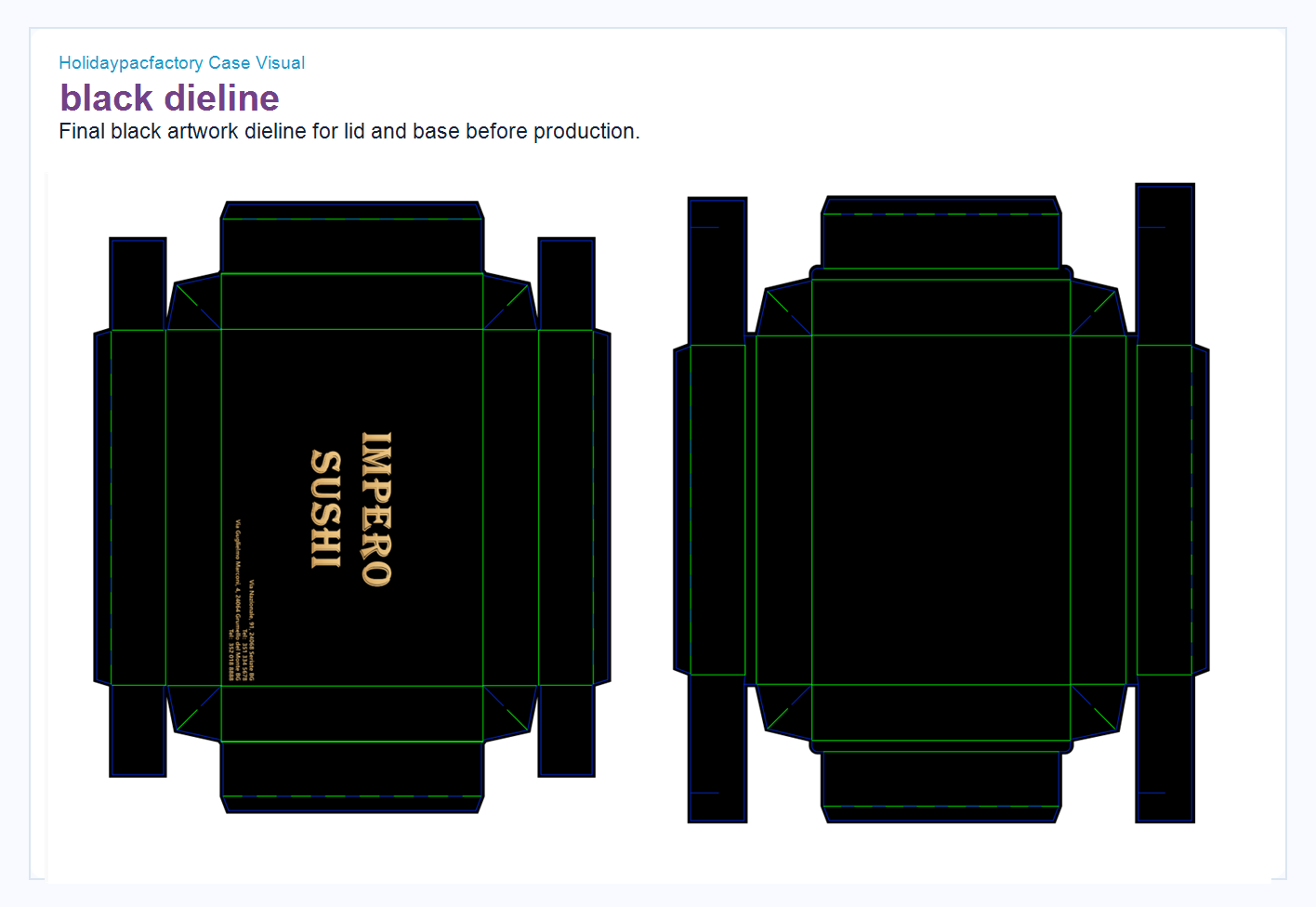
Step 6 The Dieline Converted the Approved Design Into Production InstructionsThe structural dieline is where a packaging project becomes serious. Red and green lines are not decorative. They show cut lines, crease lines, glue areas, folding panels, insert positions and print zones. A good dieline tells the factory how to produce the box consistently. A weak dieline creates risk: wrong fold direction, misaligned print, poor lid fit, exposed glue, unstable insert or wasted board. In this case, Holidaypacfactory prepared dielines for the box body, lid, side panels and insert parts. The artwork had to land on the correct panel after folding, which is especially important for a black-and-gold box. If the logo is placed beautifully on the flat file but shifts after folding, the final product will not match the buyer’s approval image. The black dieline version helped the team check final artwork appearance against structural boundaries. This is the bridge between design approval and factory production. |
From Approved Sample to Mass Production: What Holidaypacfactory Controls
After the buyer approves the visual direction and structure, the factory still needs a controlled production process. For a custom sushi box like this one, Holidaypacfactory checks paperboard selection, black surface treatment, gold foil or metallic print effect, die-cut accuracy, crease pressure, folding sequence, insert assembly, glue strength, lid-and-base fit, carton packing and finished product appearance.
Black packaging requires special attention. A dark surface can show scratches, dust, edge wear and inconsistent finish more easily than a light kraft or white board. Gold text needs sharp edges and stable positioning. If foil stamping is used, pressure and heat must be controlled. If metallic ink is used, the factory needs to check color density and drying. These are small details, but they decide whether the package feels premium when the customer holds it.
Holidaypacfactory also reviews packing logic. Sushi boxes are often used by restaurants, delivery programs, catering services and gift-style food sets. The boxes must arrive clean, flat or assembled as agreed, protected from deformation, and packed in a way that the buyer’s team can handle efficiently. A beautiful box that arrives crushed is not a successful project.
| Check paperboard thickness, stiffness and surface finish before print. | Confirm black surface and gold brand mark against approved sample. |
| Test die-cut and crease lines so folding remains clean. | Review insert fit with tray, cup lid and sauce bottle components. |
| Inspect lid fit, glue strength, panel alignment and opening experience. | Pack finished goods to protect black surfaces during export handling. |
Why the Factory Review Does Not Stop After the Artwork Is Approved
Many packaging delays happen because teams treat artwork approval as the finish line. In reality, artwork approval is only one checkpoint. For custom sushi packaging, the factory must still review production materials, prepress settings, die-cut tooling, foil position, insert assembly, finished product tolerance and packing condition. A buyer may approve a beautiful PDF, but the production team has to make thousands of pieces that repeat that approved look without drift.
For this black sushi box project, Holidaypacfactory paid attention to the relationship between appearance and handling. The product uses a dark surface, so edge quality matters. The box carries a gold brand mark, so the logo cannot be too close to crease lines or panel edges. The package has internal compartments, so the assembled insert must sit neatly inside the base. The cup and bottle positions must be easy for staff to load during daily restaurant use. The package should look premium when it is opened, but it also needs to be practical for repeat operations.
Holidaypacfactory’s production team normally separates these checks into material, printing, structure and packing. Material review asks whether the selected paperboard has enough stiffness and whether the surface finish matches the intended black appearance. Printing review asks whether the black coverage is stable and whether the gold detail remains legible. Structural review asks whether the lid, base and insert assemble without forcing. Packing review asks whether the box can survive storage and export handling without visible surface damage.
This kind of review is not glamorous, but it is where a custom packaging supplier protects the buyer. The customer sees a polished restaurant package. Behind that package is a chain of small decisions that keep the box repeatable, clean and realistic for mass production.
How Clear Files Help Importers, Restaurant Teams and Factory Staff Work Together
A custom food packaging project often involves more people than the buyer first expects. The restaurant owner cares about brand feeling. The purchasing team cares about price, quantity and delivery. The designer cares about logo placement. The factory engineer cares about folds and tolerance. The warehouse team cares about carton size. The final restaurant team cares about whether the package is easy to use during a busy service period. If the project file is unclear, each person makes a different assumption.
That is why Holidaypacfactory treats translated visuals and annotated images as part of the service. The English contract list in this article is not simply a translation for readers. It reflects how the team turns a purchasing list into a shared working document. When product name, specification, image, quantity and unit are visible, the buyer and factory can discuss the same item without confusion. When the insert layout is numbered, the team can talk about the bottle, cup lid and tray position without relying on vague descriptions.
For international buyers, this is especially valuable. A packaging project may cross languages, time zones and production teams. Clear visuals reduce the risk of misunderstanding. They also help the buyer explain the project internally. Instead of saying “the factory will make the sushi box we discussed,” the buyer can show the approved size image, the component layout, the rendering and the dieline. That makes purchasing decisions easier to approve and repeat.
The same logic applies after production. If the buyer places a repeat order, the approved file can be reused. If the restaurant adds a new menu set, the same brand language can guide a new size. If the buyer requests a matching bag, sleeve or promotional insert later, the original case file helps the factory maintain consistency.
What Other Restaurant Buyers Can Learn From This Sushi Packaging Case
The first lesson is to confirm the commercial list before developing too many design variations. Quantity, size and product type affect cost and structure. If the buyer changes these details late, the artwork and dieline may need to be rebuilt. A clear contract list gives both sides a stable base.
The second lesson is to send real component photos or samples whenever possible. For sushi packaging, the inner tray, sauce cup, lid, bottle and food height can all change the structure. A photo with numbered parts is simple, but it can prevent expensive mistakes. If the restaurant wants a premium opening experience, the insert must be designed around the real objects.
The third lesson is to separate brand mood from production detail. A restaurant reference image can guide color and feeling, but the final package should not become overloaded. Good packaging usually chooses a few strong signals and executes them well. In this project, the black surface and gold brand mark carried the premium feeling, while the internal structure handled the food presentation.
The fourth lesson is to approve both the outside and inside of the package. Many buyers focus on the lid first because that is where the logo appears. But for sushi, the inside matters as much as the outside. The customer opens the box and immediately judges the food arrangement, cleanliness and sense of care. The insert, tray and cup placement are part of the brand experience.
The final lesson is to plan repeatability. A restaurant packaging project should not rely on memory. Keep an approved image, approved dieline, material note, size list, quantity record and packing requirement. This allows future orders to move faster and keeps the packaging consistent as the restaurant brand grows.
Explore Packaging Structures Related to This Sushi Case
The case belongs to a wider packaging family: food packaging, drawer-style boxes, premium gift boxes, folding cartons and custom paper bags. These internal links help buyers compare related structures before asking Holidaypacfactory for a quote.
Cassie Lan Author Perspective: Culture Should Become Practical Packaging Judgment
Cassie Lan brings 20 years of international trade experience, 16 years in packaging and several years of AI-driven content and business practice into Holidaypacfactory’s customer communication. Her view is that packaging should not be treated as a silent commodity. It should protect the product, help the buyer communicate clearly, and carry the culture of the restaurant or brand into the customer’s hand.
In this sushi packaging case, culture did not mean adding more decoration. It meant understanding the customer’s visual world, then translating it into a manufacturable structure. The black surface, gold logo and organized insert created a calm premium feeling. The contract list, sample check and dieline turned that feeling into practical production work.
This is the kind of balance Holidaypacfactory tries to keep: brand feeling with engineering discipline, buyer communication with factory accuracy, and visual beauty with food packaging practicality.
FAQ: Custom Sushi Packaging From Contract to Production
What information should a buyer prepare for a custom sushi packaging project?
Prepare product size, quantity, food layout, tray or cup dimensions, brand artwork, preferred material, printing or foil requirements, packing method and delivery market. Photos of real components are very helpful.
Why does Holidaypacfactory check physical components before finalizing the dieline?
Small parts such as sauce cups, lids, bottles and trays affect insert size, clearance, lid fit and opening experience. Checking them early helps prevent production errors and improves the final food presentation.
Can two sushi box sizes share the same packaging style?
Yes. A consistent outside brand system can be shared across sizes, while the insert and internal structure should be adjusted for each food layout. This creates a family look without sacrificing function.
Is black foil-stamped sushi packaging difficult to produce?
It requires more attention than simple plain packaging because black surfaces show scratches and gold marks need accurate placement. Holidaypacfactory controls surface finish, foil or metallic effect, dieline accuracy, folding and packing protection.
Can Holidaypacfactory produce matching paper bags for restaurant packaging?
Yes. Matching black kraft paper bags can be developed with the box program so the restaurant has a complete takeout, gift or catering presentation.