Door to Door service
Welcome to Holidaypac Packaging Solutions Factory!

tiger@holidaypac.com

+86 136 5233 6188
Welcome to Holidaypac Packaging Solutions Factory!


tiger@holidaypac.com
+86 136 5233 6188


Related packaging range
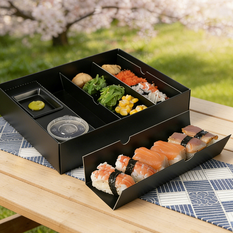
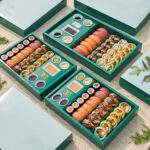
Quick Note The page now starts with the right product identity A buyer should not need to guess whether the page is talking about the same box they saw in the quotation or product gallery. This opening image resolves that immediately. Exact productCleaner matchConfident first look Range mood Coordinated green family for premium takeaway Best fit Sushi sets, chilled meals and deli counters Buyer cue Matches the real supplied product images Label room Works with stickers, dates and retail marks +Helps multi-person buying teams approve the right product faster. +Gives one recognizable outer look across several meal SKUs. | Green sushi box direction Custom Eco-Friendly Green Sushi Box with Built-In Sauce Cup for Japanese Takeaway and Retail Meal ProgramsThe most important job of this page is simple: it needs to show the same green sushi box the buyer is actually considering. That sounds obvious, but in food packaging, a mismatch between the visual set and the written positioning can weaken trust very quickly. This opening image corrects that by placing the real product family front and center. The grouped presentation makes it easy to see the green outer shell, the tidy lid structure and the way the packaging keeps a premium but approachable mood for modern takeaway and chilled retail service. For a window-led alternative, compare our kraft sushi bento box with clear window. For restaurant groups, distributors and private-label buyers, this matters because the package is usually reviewed by more than one decision maker. One person may care about branding, another about portion fit, another about operational speed and another about how the range will look in a retail cooler or a delivery photo. When the first image already communicates that the product is a coordinated green sushi-box family, the internal conversation becomes much easier. The buyer is evaluating the right object instead of mentally correcting the presentation. A bolder print-forward option appears on our high quality printed sushi bento box page. This box direction works well for brands that want a fresher, more curated visual tone. The green print story feels lively without becoming noisy, and that makes it useful for Japanese takeaway, salad-and-sushi combination programs, boutique deli counters and premium convenience meals. In practical terms, it also gives the brand a more distinctive shelf mood than a plain white or kraft carton while still staying readable and commercial. For a slower premium opening experience, browse our luxury sushi drawer bento box. Holidaypacfactory can position this format as a strong bridge between presentation and day-to-day usability. The box feels designed, yet it is still clearly made for real service: it stacks into a product family, supports repeat branding and gives buyers room to build a more consistent visual system across meal lines. That is the right place to start because it turns the page from a generic food-box listing into a commercial tool built around the exact green sushi box the customer wants. A stronger compartment-led layout can be seen in our compartment paper sushi bento box. |
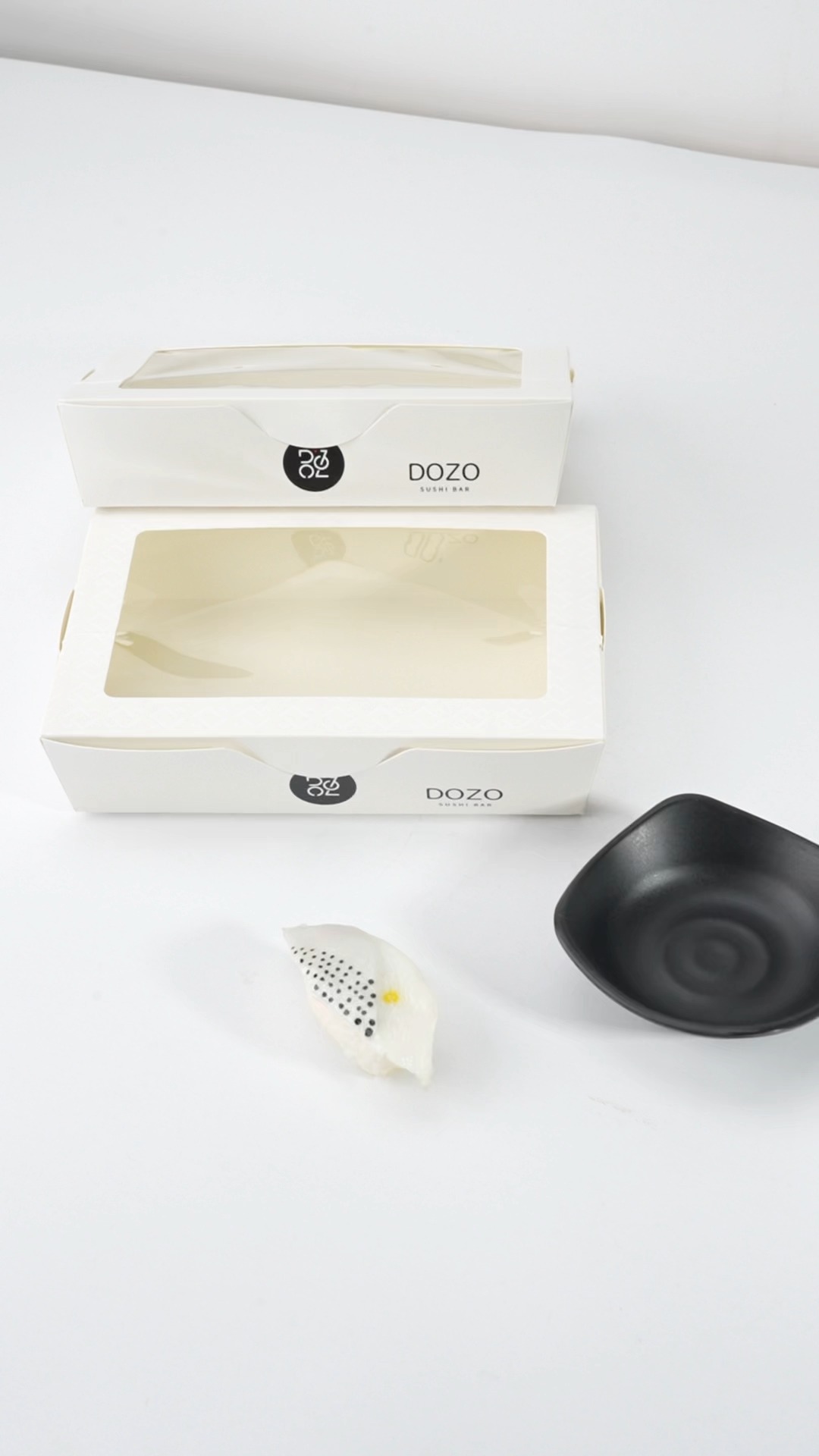
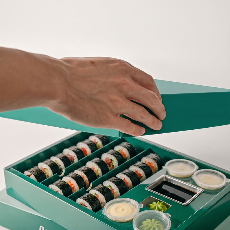
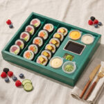
Built-in sauce cup advantage Use the Integrated Sauce-Cup Layout to Keep Sushi, Garnish and Condiments More OrganizedThis second image is where the product becomes more than a color story. The open-lid view shows how the built-in sauce-cup position supports the meal after packing. In Japanese takeaway and sushi retail, sauce management is not a small detail. If a condiment cup slides or sits awkwardly, the entire meal can feel less thoughtful. Here, the cup area is part of the composition, which helps the product feel more intentional and keeps the rest of the food surface easier to read at first glance. For a wider paper-packaging assortment, open our sushi, bento and deli paper boxes page. That matters for both food presentation and operating rhythm. Staff can pack more consistently when the sauce position is predictable, and the finished meal looks more stable because the tray does not need an improvised add-on. The customer benefits too. Once the lid is opened, the contents look planned rather than crowded. Rolls, nigiri, garnish and dipping sauce appear as parts of the same meal, not as separate items trying to share space. Retail buyers also review our custom kraft window food boxes. For distributors and importers, this feature also makes the product easier to explain downstream. A built-in sauce-cup concept is a real functional story, not just a stylistic claim. It is useful for sushi bars, prepared-food counters, premium convenience formats and even event catering where a neater open view can improve the perceived value of the meal. When the page uses this exact image beside the text, the buyer can immediately connect the structural benefit to a real meal arrangement. A more compliance-focused sustainable assortment is shown in our PFAS-free paper food packaging solutions. This is the kind of detail that often drives repeat orders. A box that merely looks attractive can win initial interest, but a box that also helps food teams maintain a cleaner packing result is more likely to stay in the assortment. That is why the sauce-cup layout deserves a dedicated section. It shows the buyer that the green sushi box is not only visually pleasant; it is built to support service consistency in real daily use. For meal-prep packaging in the same family, see our custom picnic box. | Quick Note Condiment control helps the meal look more premium When sauce has a dedicated place, the rest of the meal can stay cleaner, which usually improves customer perception and makes the food easier to photograph and serve. Cleaner revealLess movementEasy packing Core benefit Built-in sauce position keeps the tray orderly Packing flow Faster assembly for daily service teams Open view Food reads clearly the moment the lid lifts Use scene Takeaway sets, retail meals and catering trays +Reduces the improvised feel that loose condiment cups can create. +Makes the meal easier to photograph for menus and delivery listings. |
Quick Note A good food box should also feel photogenic Many food brands now judge packaging by how it looks in natural-light photos, delivery menus and social posts, not only on a trade-sheet sample board. Retail moodNatural photosBrand memory Visual tone Fresh, calm and contemporary green identity Shelf use Suitable for boutique chilled display Photo value Reads well in close-up delivery photography Brand fit Stronger than plain white without feeling loud +Lets the food stay central while the pack still looks distinctive. +Supports a more memorable daily packaging system for repeat customers. | Branding and visual tone Give Premium Takeaway and Boutique Retail Programs a Cleaner, More Recognizable Green Brand SignatureA grouped product shot proves range consistency, but a single-box image tells the buyer something else: whether the design still looks refined when only one meal is presented. That is a critical test. In many real settings, customers are not looking at a full product family; they are seeing one box in a deli cooler, on a cafe counter or in a takeaway handoff. This quieter image shows that the green outer pattern still feels composed and intentional in that closer, more individual moment. A smaller everyday paper-pack reference is our food grade disposable paper sushi box. The green color story is useful because it suggests freshness without relying on heavy decoration. For sushi, salad-led combinations and light prepared-food assortments, that matters. The pack can feel contemporary and distinctive while still allowing the food itself to remain central. Buyers who want a stronger visual identity than plain kraft often look for exactly this balance: enough color to be memorable, but not so much that the packaging overwhelms the meal. For chilled and deli programs, buyers often pair this with our PFAS-free takeaway and deli packaging range. This section is also important for private-label projects. A brand may want the box to feel softer, more natural or more giftable than an ordinary utilitarian tray, especially when the product is sold in premium takeaway channels or photographed for online ordering. A controlled single-box view makes it easier to judge if the graphic direction supports that ambition. It gives the customer a more realistic sense of how the final pack will behave as part of a brand system. For a window-led alternative, compare our kraft sushi bento box with clear window. By pairing this image with commercial copy rather than generic decorative language, the page becomes much more useful. The buyer is not being asked to admire packaging in the abstract. They are being helped to decide if this exact green sushi box can carry the right emotional tone for their store, menu and customer segment. That is where design value becomes commercially meaningful rather than merely visual. A bolder print-forward option appears on our high quality printed sushi bento box page. |
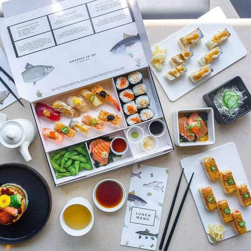
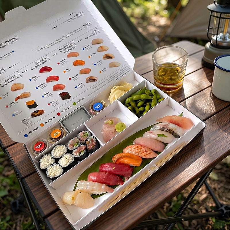
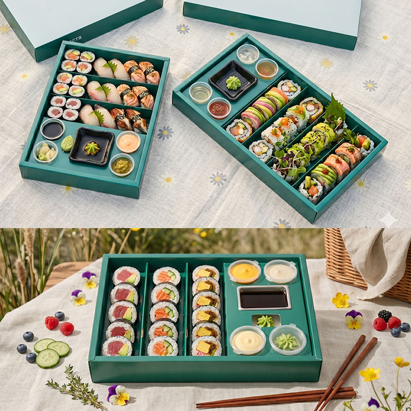
Menu range and assortment planning Support Sushi Rolls, Bento Combinations, Deli Sets and Lighter Fresh-Food Assortments with One Coherent Packaging DirectionBuyers almost never think about packaging as a one-photo decision. They need to know whether a format can support real assortment growth. This image helps answer that question because it shows the green sushi box in a wider meal context. The implication is important: the same packaging family can move across different food arrangements and still retain its identity. That makes it more practical for restaurant groups, multi-store operators and private-label food brands that are planning more than one finished set. For a slower premium opening experience, browse our luxury sushi drawer bento box. From a commercial point of view, that flexibility reduces friction. If a product family can serve classic sushi sets, mixed bento-style meals, snack assortments and chilled retail combinations, the buyer has more room to consolidate purchasing and present a stronger brand line to customers. The green print becomes a connecting thread rather than a one-off novelty. This helps the final shelf or takeaway display feel more coherent and easier for customers to remember. A stronger compartment-led layout can be seen in our compartment paper sushi bento box. This is especially useful in prepared-food retail, where product mixes change with seasons, promotions and local demand. A box that looks strong with several meal compositions gives the operator more freedom. It becomes easier to introduce a fruit-and-sushi combo, a chef special set or a lighter lunch range without needing a completely separate visual system. That can improve both merchandising consistency and reorder confidence. For a wider paper-packaging assortment, open our sushi, bento and deli paper boxes page. Holidaypacfactory should present this flexibility as part of the value proposition. The box is not only a container for the exact meal shown in one lifestyle shot. It is a format that can help the customer build a broader program. When the page includes this collage-style module, the buyer can picture the packaging performing across the menu rather than only in a controlled sample scene. Retail buyers also review our custom kraft window food boxes. | Quick Note The best packaging systems stretch across the menu If a box only works for one exact food photo, it is hard to scale. When it handles several meal combinations gracefully, it becomes easier to reorder and extend. Menu growthRetail varietyRepeat ordering Menu spread Works across sushi, deli and mixed meal sets Retail value Keeps several SKUs visually connected Growth path Supports seasonal and promotional line extensions Buyer value Easier consolidation for repeat ordering plans +Useful when one distributor or chain wants a coherent packaging family. +Helps future launches feel related instead of assembled from separate box styles. |
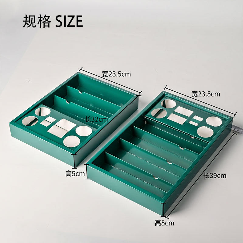
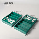
Quick Note The box has to fit the meal, not just the mood board Size direction, sauce-cup needs and food volume should all be clarified early so the final sample does not look good in theory but fail during packing. Size logicSample accuracyClear briefing Planning step Pick portion logic before approving artwork Meal fit Match tray footprint to food count and sauce need Sample goal Reduce revisions by briefing the real menu first Reorder value Clear size choice supports smoother future buying +A balanced page should make the size discussion feel practical, not dry. +Moving the specification table below the row keeps the visual module cleaner. | Size and structure planning Move from Visual Approval to Real Size Planning, Fill Logic and Reorder-Friendly Product DefinitionAt some point every attractive packaging page has to become practical. This size-reference image helps the buyer transition from liking the green sushi box to planning the actual format they need. That change is important because a strong sample only becomes a successful commercial product when the chosen size, fill volume and condiment arrangement all match the intended meal. The page should encourage that kind of serious planning instead of remaining only at the inspiration level. A more compliance-focused sustainable assortment is shown in our PFAS-free paper food packaging solutions. The right conversation usually starts with the food. Buyers should define whether the pack is for a compact sushi portion, a fuller combination meal or a premium takeaway set that includes a larger sauce requirement or side item. From there, the structure can be matched more accurately. The built-in sauce-cup concept, tray depth and outer footprint all become easier to evaluate once the real meal behavior is on the table. For meal-prep packaging in the same family, see our custom picnic box. This is also where importers and distributors add value for their own customers. By gathering meal photos, target portion logic and branding expectations early, they can move more smoothly into quoting, sample approval and repeat supply. A page that shows size planning as a serious part of the product discussion helps reinforce that Holidaypacfactory is prepared for structured B2B development rather than purely decorative packaging talk. A smaller everyday paper-pack reference is our food grade disposable paper sushi box. Putting the specification table below this row keeps the visual flow cleaner and gives the buyer a better reading experience. The image still anchors the section, but the operational details can breathe underneath it. That balance matters on long product pages because it keeps the design premium while still making the practical content easy to scan and easy to act on. For chilled and deli programs, buyers often pair this with our PFAS-free takeaway and deli packaging range. |
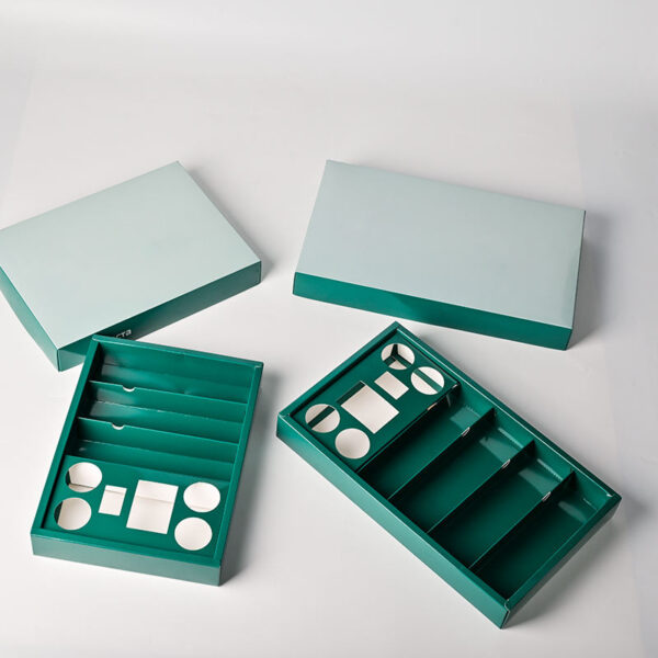
Empty structure and range consistency Judge the Paper Form Itself So Future Size Extensions and Repeat Orders Stay More ConsistentFood-filled images are excellent for mood and merchandising, but an empty-box image answers a different set of questions. It lets the buyer study the paper form directly. The tray proportions, lid lines and interior organization become easier to understand when there is no food visually competing for attention. For technical teams, that clarity can be extremely helpful when comparing options, approving direction and planning how the design may extend into a wider packaging family. For a window-led alternative, compare our kraft sushi bento box with clear window. This is also the image that often helps with long-term thinking. A box may look strong in one hero meal shot but still be difficult to standardize if the underlying structure is awkward. When the empty form already feels resolved and balanced, the buyer can be more confident that custom branding, additional sizes and repeat production will remain visually consistent. That matters for distributors, chain operators and private-label programs where line discipline has real commercial value. A bolder print-forward option appears on our high quality printed sushi bento box page. The empty-pack section gives Holidaypacfactory a chance to underline manufacturing seriousness without turning the page technical in the wrong way. It shows that the product is not only a mood-driven green shell. It is a defined paper packaging format that can support real sourcing conversations, structured sample approval and a more scalable brand family for future meals and campaigns. For a slower premium opening experience, browse our luxury sushi drawer bento box. Closing the story modules with this image also leaves the buyer with the right final impression: the box is attractive when filled, but it also stands up on its own as a well-considered paper structure. That combination is what makes the product more compelling. It feels ready for both presentation-led selling and dependable repeat use across premium takeaway and retail meal programs. A stronger compartment-led layout can be seen in our compartment paper sushi bento box. | Quick Note Strong structure usually means easier scaling When the basic paper form is well resolved, it becomes easier to adapt graphics, extend sizes and keep the family looking consistent across future reorder cycles. Reliable formRange extensionLong-term use Technical view Lets teams judge tray form without food distraction Line extension Helps future sizes stay within one clear family Brand control Supports cleaner repeat printing and graphic updates Supply logic Better for long-term sourcing and specification reuse +A good empty-pack image proves the structure stands on its own merit. +This is often the view buyers use when comparing one supplier format against another. |
Start by sending the real meal photo or plate logic, not only a general category label. Sushi packaging is judged by arrangement, so the sample works better when Holidaypacfactory can see whether the meal is roll-heavy, nigiri-led, mixed with fruit or built as a more complete bento-style combination. For a wider paper-packaging assortment, open our sushi, bento and deli paper boxes page.
Clarify the condiment plan early. Because the built-in sauce-cup position is one of the product’s defining features, buyers should specify how many sauces or wet accompaniments are involved, how full the cup needs to appear and whether the presentation should emphasize order, gifting or fast everyday takeaway. Retail buyers also review our custom kraft window food boxes.
Discuss the print mood as a commercial instruction, not just a color preference. The green direction on this product suggests freshness and premium calm, but different buyers may want that look to feel more natural, more playful, more giftable or more retail-clean depending on the channel. A more compliance-focused sustainable assortment is shown in our PFAS-free paper food packaging solutions.
Reserve clear zones for labels, barcodes and date marks from the beginning. A package can look elegant in a clean rendering and still feel crowded once practical stickers are added. Early label planning protects the finished look and avoids disappointment during the sample-review stage. For meal-prep packaging in the same family, see our custom picnic box.
Finally, define how the product will be sold over time. A one-off seasonal launch, a private-label retail program and a multi-store takeaway line each ask for slightly different decisions around size planning, print depth and carton repeatability. When those points are clear, the sample becomes much easier to refine into a reliable reorder item. A smaller everyday paper-pack reference is our food grade disposable paper sushi box.
This product works well in premium convenience food because it gives the meal a composed look without demanding a luxury-only price position. The green print is memorable, the built-in sauce-cup layout feels considerate and the full structure remains practical enough for fast service and repeat use. For chilled and deli programs, buyers often pair this with our PFAS-free takeaway and deli packaging range.
It also performs well in photo-driven takeaway environments. Delivery menus, social posts and app listings all reward packaging that looks organized the moment it is opened. A cleaner sauce layout and a calmer paper shell help the food appear more deliberate, which can support better perceived value when customers are choosing quickly. For a window-led alternative, compare our kraft sushi bento box with clear window.
For private-label buyers, this format offers a strong middle ground between plain commodity packaging and highly theatrical premium boxes. The product already has a distinct personality, yet it can still be adapted through logo placement, outer-graphic refinement and size selection to fit a brand that wants a more recognizable daily packaging system. A bolder print-forward option appears on our high quality printed sushi bento box page.
Retailers benefit because the same box direction can help different SKUs feel related. Sushi sets, lighter bento combinations, chilled lunch assortments and premium snack meals can all sit closer together visually when the packaging family is disciplined. That kind of range consistency helps customers identify the brand more easily across multiple visits. For a slower premium opening experience, browse our luxury sushi drawer bento box.
From Holidaypacfactory’s point of view, this is why the page should stay tightly aligned to the exact product images. The value of the box is strongest when the customer can connect the real green product, the real built-in sauce-cup structure and the real commercial use scenes in one uninterrupted story. Once that alignment is right, the page becomes much more persuasive and much easier to convert into an order conversation. A stronger compartment-led layout can be seen in our compartment paper sushi bento box.
It keeps condiments visually organized inside the meal set, which usually improves presentation, makes packing more repeatable and helps the customer read the food more quickly after opening the lid. For a wider paper-packaging assortment, open our sushi, bento and deli paper boxes page.
Yes. It suits sushi rolls, nigiri, mixed bento combinations, lighter deli meals and several grab-and-go fresh-food programs as long as the size and fill logic are chosen around the actual portion plan. Retail buyers also review our custom kraft window food boxes.
It helps buyers move beyond visual approval and define the real tray footprint, meal volume and condiment needs, which makes the first sample much more likely to match the intended selling format. A more compliance-focused sustainable assortment is shown in our PFAS-free paper food packaging solutions.
Please send meal photos, target portion size, condiment expectations, branding mood, label requirements and the main sales channel so the project can be matched to the right structural direction more accurately. For meal-prep packaging in the same family, see our custom picnic box.